
Last Updated: October 28, 2026
Quick Summary
You can transform living spaces by choosing colors that set the mood, adding texture that catches light, and hanging art at the right size and height. Start with one piece you love, then build a cohesive palette around its colors. Layered lighting reveals brushwork and adds depth, making the room feel personal and inviting.
- Color sets the emotional tone of a room before any object is noticed.
- Give roughly 60 percent of visual weight to a dominant color, 30 percent to a supporting color, and 10 percent to an accent.
- Test paint samples on a board in morning, midday, evening, and night light for two or three days.
- Hang the center of artwork at 57 to 60 inches, with 6 to 8 inches above furniture.
- Make the artwork fill about two-thirds of the wall space above a sofa or table.
Table of Contents
- Why Color and Dimension Change How a Room Feels
- How to Decorate with Art to Build Warmth and Personality
- Choosing a Cohesive Color Palette and Working with Contrast
- Adding Depth Through Texture, Palette Knife Work and Layered Lighting
- How to Arrange Paintings on a Wall for Balance and Flow
- Artwork Size Guide for Living Rooms and Small Spaces
- How to Care for Original Paintings So They Last
- Bringing Joy Into Your Own Home With a Piece You Love
- Frequently Asked Questions
Why Color and Dimension Change How a Room Feels
Color and dimension shape how a room feels long before anyone notices a single object, and the right choices can transform living spaces from ordinary to inviting. A warm wall can make a space feel close and cozy, while a cool palette can open it up. Emma Bell Fine Art offers original paintings created with palette knife and mixed media techniques, bringing color and texture into everyday rooms.
Researchers at Ohio University note that strategically incorporating different colors can create atmospheres suited to particular emotions and activities (The Art of Space on how interior design shapes environments). That means the colors you choose do real work. They set the mood before you even sit down.
Dimension matters just as much. Thick texture catches light at different angles.
- Color sets the emotional tone of a room
- Texture adds depth
- Light changes how both color and texture read
How to Decorate with Art to Build Warmth and Personality
Art is often the fastest way to make a room feel like yours and to transform living spaces with personal character. For guidance on choosing statement pieces for living room walls, see our picks for scale, color, and texture. Start with one piece that you truly love, then build the rest of the room around its colors. This approach keeps the space personal instead of catalog-perfect.
Look for a painting that holds a color you already want in the room. Then repeat that color in a pillow, a rug, or a vase. The repetition ties the space together without making it feel matchy.
Scale matters too. A large piece can anchor a sofa wall, while a smaller work works well in a hallway or reading nook. Focus on how the art makes you feel when you walk in.
Choosing a Cohesive Color Palette and Working with Contrast
A cohesive palette does not mean everything matches. You can learn how to match artwork colors with your room, furnishings, and light for a more intentional result. It means the colors share a common thread, such as warm undertones or a shared pink family. Pick three to five main colors and use them across the room, then let contrast do the heavy lifting.
The 60-30-10 split. A reliable starting point is to give roughly 60 percent of the visual weight to a dominant color (usually walls and large upholstery), 30 percent to a supporting color (rug, curtains, secondary furniture), and 10 percent to an accent (artwork, pillows, ceramics). This ratio keeps a bold painting from fighting the room and gives the eye a clear place to land.
Read the undertones, not just the color name. Two grays can behave very differently: a warm gray with a red or yellow base can look beige next to a cool blue, while a cool gray with a blue-green base can look icy beside warm wood. Hold paint chips and fabric swatches next to each other, not in isolation, and compare them against the fixed elements you cannot change, flooring, countertops, and the artwork itself.
Test in the actual room, in the actual light. This is the step most guides skip. Paint a sample board (not the wall) in two coats and move it around the room:
- Morning: Check the wall that gets direct sun first. Warm light can push yellows and reds forward.
- Midday: Look at the wall opposite the windows, where light is indirect and colors read closest to true.
- Evening: Turn on the lamps you actually use. Warm bulbs (around 2700K) can turn a crisp white creamy and make a cool blue look muddy.
- Night: Check under overhead light only, since that is how most people see the room after dark.
Live with the sample for at least two or three days before committing. A color that looks rich in a bright showroom can turn flat under warm lamps, and a bold painting that sings in daylight can go quiet at night.
Contrast gives a palette its energy. Pair a bold painting with neutral walls and soft fabrics. The neutrals let the artwork stand out without competing with it. If the room already has strong texture, palette knife ridges, linen, rough wood, keep the wall color quieter so the texture reads.
Common palette mistakes to avoid:
- Buying paint before the artwork or rug is chosen, then trying to match it later.
- Testing swatches on a wall that gets different light than the rest of the room.
- Using more than one strong accent color in a small space, which fragments the eye.
- Ignoring the undertone of fixed finishes, which can make a well-chosen color look off.
Adding Depth Through Texture, Palette Knife Work and Layered Lighting
Palette knife painting creates raised ridges and layered color that catch the light. Readers curious about the technique can explore a deeper guide to palette knife painting for modern homes. Each stroke adds a bit of shadow, which gives the painting a sense of movement.
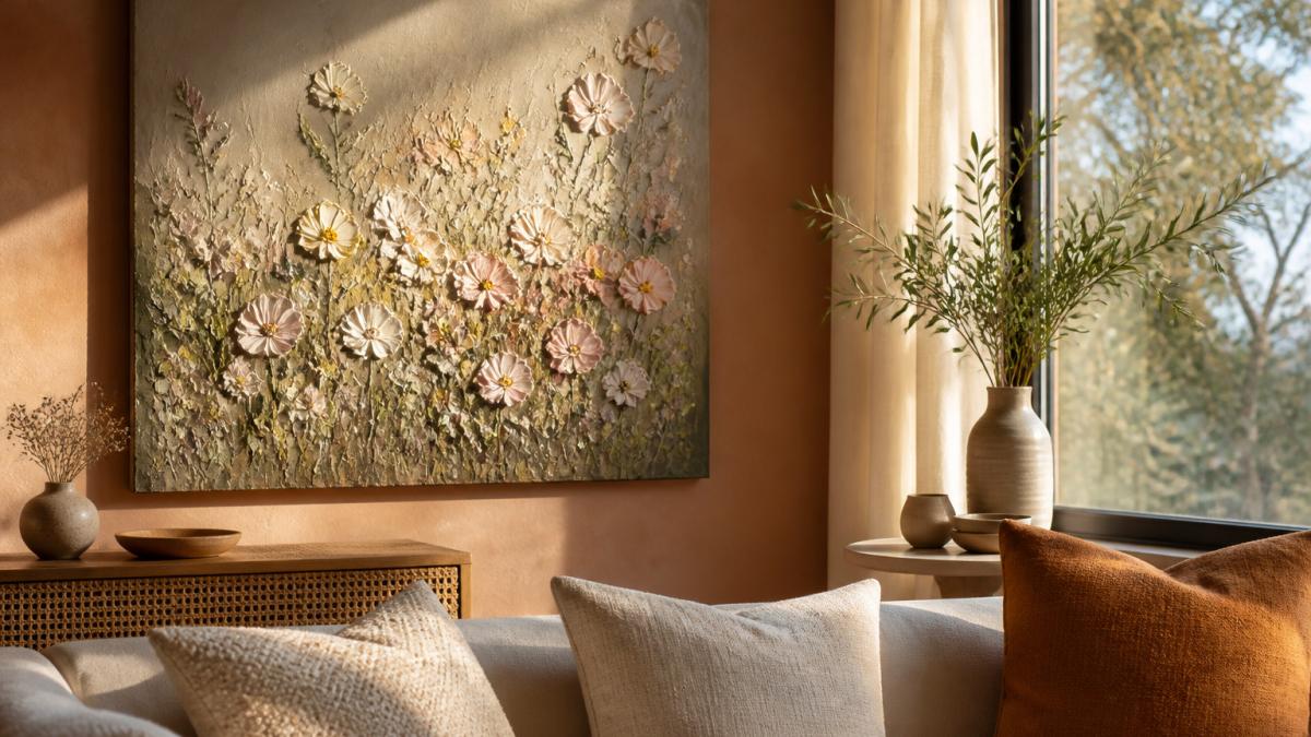
Layered lighting brings this texture to life. Use a mix of overhead light, table lamps, and a picture light or wall wash for the art. Angled light across the surface reveals the brushwork.
A room with texture, varied light, and a few tactile materials feels more inviting. Think linen, wood, and soft wool alongside the painting.
"The textures and colors you choose set the tone for how a room is experienced.", Interior design guidance commonly shared by design educators
How to Arrange Paintings on a Wall for Balance and Flow
Arranging art well starts with the room's layout, not the wall. Before you touch a hammer, walk the room and note where people enter, sit, and pause.
Start with a floor plan, then a paper template. Measure the wall and the furniture below it, then cut paper templates to the exact size of each frame. Tape them to the wall and live with the arrangement for a day.
Hang at eye level, with a rule. The general standard is to place the center of the artwork about 57 to 60 inches from the floor, which is roughly eye level for an average adult.
Spacing in a gallery group. Keep 2 to 3 inches between frames for a tight, cohesive group, or 3 to 4 inches for a looser, more casual feel. Pick one alignment, bottoms, centers, or tops, and hold it. Aligning centers works best when frames are different sizes; aligning bottoms works best when the pieces share a similar scale.
Balance comes from variety, not symmetry. Pair one large, bold piece with two smaller ones in a related color. This creates a visual rhythm that guides the eye around the room. If the wall feels heavy on one side, move a smaller piece to the opposite side rather than adding another large one.
Clearance and flow. Keep at least 36 inches of walkway clearance in front of any wall where art hangs at seated eye level, and avoid hanging pieces where a door swing or cabinet door will hit them.
Small spaces and rentals. A single medium piece often works better than several small ones. Use removable adhesive strips rated for the frame's weight, and check the rating before hanging, a textured canvas can be heavier than it looks.
Troubleshooting checklist:
- Art looks too small? Add a larger frame or a wider mat rather than buying a new piece.
- Group feels scattered? Reduce the spacing and align the centers.
- Wall feels top-heavy? Lower the group so the center sits closer to 57 inches.
- Room feels cluttered? Remove one piece and let the strongest work breathe.
Artwork Size Guide for Living Rooms and Small Spaces
Size is one of the most common mistakes in home décor. A painting that is too small can look lost, while one that is too large can overwhelm a room. As a simple rule, the artwork should fill about two-thirds of the wall space above a sofa or table. If your bedroom is small, see how to choose floral art for small bedrooms.
Small spaces need care. A single medium piece often works better than several small ones. Choose lighter colors on smaller walls to keep the room airy, and save bold, textured work for a single focal point.
The article gives a few practical numbers for choosing and placing art, which are summarised below.
| Item | Value | Note |
|---|---|---|
| Artwork size above a sofa or table | About two-thirds of the wall space | Simple rule for a balanced fit |
| Small spaces | One medium piece | Often works better than several small ones |
| Wall colour in small rooms | Lighter colours | Keeps the room airy |
| Hanging height (centre of artwork) | 57 to 60 inches | Roughly eye level for an average adult |
| Gap above furniture | 6 to 8 inches | Between frame bottom and furniture top |
| Gallery frame spacing | 2 to 4 inches | Tight or looser group feel |
| Walkway clearance | 36 inches | In front of art at seated eye level |
How to Care for Original Paintings So They Last
Original paintings with thick texture need gentle handling. Keep them away from direct sunlight, which can fade pigments over time. Dust them lightly with a soft, dry brush and avoid harsh cleaners.
Hang the piece on a interior wall away from heat sources, such as radiators and fireplaces. Keep humidity moderate, since big swings in moisture can affect canvas and paint.
Bringing Joy Into Your Own Home With a Piece You Love
The best art in a home is the piece that makes you smile every time you see it. Emma Bell Fine Art offers textured works created with palette knife and mixed media techniques. Our top pick for a statement piece is the Lilly Field Abstract, an original 48x48 painting with layered palette knife texture, priced at $2,800.00 (Lilly Field Abstract).

For a more budget-friendly option, the Summer Hush giclee print on canvas is available for $200.00 and brings the same cheerful floral feel to a wall.
Frequently Asked Questions
How can art transform a living space?
Art can contribute to a room's emotional tone. A large original painting with visible brushwork and palette knife texture adds depth, and its colors can pull together a room's existing palette. Place one strong focal piece on the wall that people see first when they enter, then let smaller works support it. Pieces chosen for color and mood, rather than simply to fill a gap, make the space feel personal and finished.
What size painting should you choose for a living room?
As a general rule, the artwork should fill roughly two-thirds of the width of the furniture beneath it, such as a sofa or console. A 48 x 48 inch canvas and a 24 x 30 inch piece are available options. Larger pieces create a bold focal point, and multiple smaller works can be grouped when one large canvas would overwhelm the space.
How do you care for original paintings at home?
Hang original paintings away from direct sunlight, heating vents and high humidity, since these can fade pigments and warp the canvas. Dust gently with a soft, dry brush or microfiber cloth, and avoid household cleaners. Gallery wrapped canvases can be hung without glass, which keeps the textured surface visible. Check hanging hardware periodically and have any damage assessed by a professional conservator rather than repaired at home.
