
Table of Contents
- Why Palette Knife Painting Belongs in Modern Homes
- Impasto Texture Paintings: How Three-Dimensional Surfaces Change a Room
- How to Display Textured Art Without Clashing With Your Interior
- Custom Palette Knife Commissions: From Wedding Bouquets to Pet Portraits
- Sizing, Framing, and Caring for Original Textured Paintings
- DIY vs Commissioning: What Actually Works for Modern Homes
- Frequently Asked Questions
Last Updated: September 11, 2026
Why Palette Knife Painting Belongs in Modern Homes
Palette knife painting is the practice of applying oil or acrylic paint with a flat, flexible blade rather than a brush, producing raised, sculptural surfaces that catch light and cast shadows. In an era when so much of modern decor is smooth, flat, and screen-adjacent, that physical texture gives a room something a print cannot: dimension you can see from across the room and feel under your fingertips. This guide from Emma Bell Fine Art covers how to choose, display, and live with these works, and why they fit clean-lined interiors better than most people expect.
The common assumption is that heavy texture belongs in a farmhouse or a rustic setting. In practice, the opposite is often true. A minimalist room with neutral walls and low furniture gives a textured painting room to breathe, and the painting becomes the focal point instead of competing with pattern. Designers have leaned into this contrast for years, pairing quiet architecture with one bold, tactile surface. According to Artsy's coverage of texture in contemporary collecting, collectors increasingly seek work with physical presence over flat imagery, a shift that mirrors how people want their homes to feel: layered, warm, and human.
For anyone new to the style, the appeal comes down to three things:
- Depth that shifts as you move through the room
- Movement built into the surface through layered strokes
- Energy that a flat print simply cannot replicate
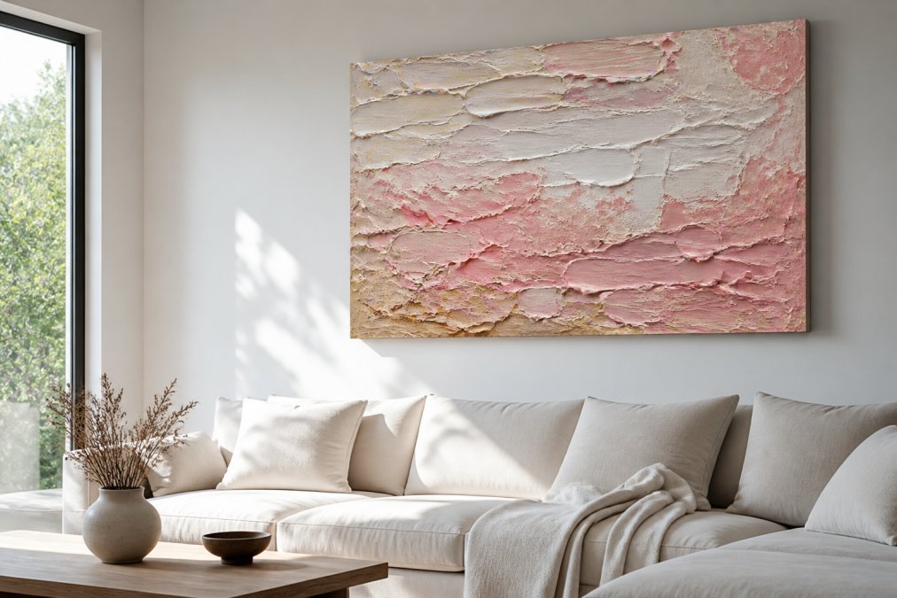
Impasto Texture Paintings: How Three-Dimensional Surfaces Change a Room
Impasto texture paintings are works in which paint is laid on thick enough to stand off the canvas, often a centimeter or more, so the surface itself becomes part of the composition (tate.org.uk). The technique dates back centuries, but its effect in a contemporary room is entirely modern: the ridges and peaks scatter light differently depending on the time of day, so the painting never looks quite the same twice.
That changing surface does real work in a space. A flat canvas reflects light evenly and reads as a single block of color; an impasto surface breaks light into highlights and shadows, which gives the wall depth without adding visual clutter. This is why textured abstract work pairs so well with the restrained palettes of modern interiors. The painting supplies the complexity, and the room supplies the calm.
What most guides miss is that impasto is not just decoration, it is a record of the making. Every ridge is a decision the artist made with the knife, and you can trace the movement of the hand across the canvas. That is the difference between a painting that matches your sofa and one you keep looking at.
How to Display Textured Art Without Clashing With Your Interior
The best way to display textured art is to treat it as the room's focal point, not an accessory, and to give it enough clear wall space that the surface can be read from a distance. Clutter around a textured piece flattens its impact; negative space restores it.
Color Theory for Textured Art in Modern Interiors
Color theory for textured art works differently than for flat paintings, because the raised surface adds its own highlights and shadows to whatever palette you choose. A warm pink or coral reads softer on impasto than on a flat canvas, since the ridges catch light and lighten the overall impression. Cool blues and greens tend to feel deeper and more dramatic for the same reason.
A practical approach: pull one color from the painting into the room, not three. A single cushion, a ceramic vase, or a throw in a shade lifted from the canvas ties the work to the space without turning the room into a matching set. If your interior is neutral, choose a painting with a bolder palette and let it carry the color. If your room already has strong color, choose a painting with a tighter, more tonal range.
Lighting and Placement for Maximum Texture
Lighting decides whether a textured painting looks flat or alive. Side lighting, from a window or an angled lamp, rakes across the surface and throws the impasto into relief. Direct overhead light flattens it. Hang the piece where daylight crosses it at an angle during the hours you actually use the room, and add a warm, adjustable picture light for evenings.
Placement follows the same logic. Eye level, roughly 145 to 150 centimeters from the floor to the center of the canvas, keeps the work in your natural sightline (nga.gov). In a living room, the wall behind a sofa is the classic spot; in a bedroom, the wall opposite or beside the bed works well, since you see it first thing in the morning and last thing at night. A large canvas over a low sofa anchors the seating area; a smaller piece on a narrow wall adds interest without crowding.
| Room | Best Placement | Lighting Approach | Why It Works |
|---|---|---|---|
| Living room | Wall behind the sofa | Angled daylight plus picture light | Anchors seating, becomes focal point |
| Bedroom | Wall opposite or beside the bed | Soft, warm, dimmable | Seen at start and end of day |
| Hallway | End of a sightline | Directional spotlight | Guides the eye through the space |
| Dining room | Side wall, not behind diners | Side light from window | Texture reads during long meals |
Custom Palette Knife Commissions: From Wedding Bouquets to Pet Portraits
Custom palette knife commissions are original paintings made to order, typically from photographs or a specific brief, so the finished piece reflects a moment, a person, or a place that matters to you. The most requested subjects tend to be wedding bouquets, pet portraits, and coastal or landscape scenes, because each carries both a memory and a natural fit for textured, expressive paint.
A bouquet is a good example of why the medium suits the subject. Fresh flowers fade within days, but a commission preserves the arrangement in layered, tactile paint, so the color and shape of that specific day stay on your wall. The same logic applies to a pet portrait: the knife strokes can suggest fur, movement, and character in a way a smooth rendering often cannot.
If you are considering a commission, the process is usually simpler than people fear. You share reference photos and any preferences, the artist works from those, and you review the piece before it ships. At Emma Bell Fine Art, commissions are built around exactly this kind of brief, and the finished work can be delivered as a gallery-wrapped canvas or on archival fine art paper, depending on how you want to hang it.
Sizing, Framing, and Caring for Original Textured Paintings
Sizing and framing decisions come down to wall proportion and the nature of the surface. As a rule, a painting should occupy roughly two-thirds to three-quarters of the width of the furniture below it. A sofa that is 200 centimeters wide pairs well with a canvas around 130 to 150 centimeters across. Too small, and the piece floats; too large, and it overwhelms the room.
Framing a textured work is optional, and often best avoided. A gallery-wrapped canvas, where the painting continues around a deep stretcher, can hang as-is with no frame at all, which suits modern interiors. If you do frame, choose a simple float frame that leaves a small gap between canvas and frame, so the raised paint never presses against the wood. Behind glass, impasto loses its shadows and its point.
Care is straightforward once you know the rules:
- Keep the painting out of direct, prolonged sunlight to prevent fading and discoloration
- Dust gently with a dry, soft brush, never a damp cloth
- Never press or wipe across the raised surface, as impasto can chip if handled roughly
- Avoid hanging above a heat source or in a damp room
- For heavy impasto that has collected dust in the ridges, use a soft-bristled brush at a low angle
For deeper cleaning or any repair to a damaged ridge, work with a conservator rather than attempting restoration yourself. Heavy impasto is more fragile than it looks, and a wrong solvent can lift color permanently.
DIY vs Commissioning: What Actually Works for Modern Homes
DIY and commissioning solve different problems, and the right choice depends on what you want the painting to do. If the goal is to fill a wall, learn a technique, and enjoy the process, DIY palette knife work is a genuinely rewarding weekend project. If the goal is a specific size, a specific palette, and a piece tied to a memory, a commission delivers something DIY rarely matches.
The honest trade-offs:
- DIY gives you control, low cost, and the satisfaction of making it yourself, but texture and color are hard to control, and the result may not hold up as a long-term focal point.
- Commissioning gives you a professional finish, a custom size, and a piece built around your subject, but it costs more and takes time.
- Prints sit in between: they offer the look of textured work at a lower price, though without the three-dimensional surface.
There is also an angle most articles ignore: texture does more than look good. Layered, three-dimensional surfaces on canvas can soften sound reflections in a room, acting as a modest acoustic buffer in spaces with hard floors and bare walls. It is a small effect, but in a minimalist interior it is a real one.
For collectors weighing quality, the question is not whether a commission costs more than a print, but what you are buying with the difference: an original, handcrafted surface that exists once, in the size and palette you chose, and that will not appear on anyone else's wall. Emma Bell Fine Art's original works, such as the Lilly Field Abstract and Spring Blossom Abstract, are built from exactly this kind of layered, gallery-wrapped canvas, and the studio's commission service extends the same approach to your own subject, whether that is a bouquet, a pet, or a coastline.

Choosing art for a modern home is easy when you only need something to fill a wall. It gets harder when you want a piece that carries a memory and still fits a clean, contemporary space. That is the balance Emma Bell Fine Art is built around: original palette knife and mixed media paintings, custom commissions for wedding bouquets and pet portraits, and formats that range from gallery-wrapped canvas to archival fine art paper. If you want a painting that adds color, dimension, and joy to a room while preserving a moment you never want to lose, Emma Bell Fine Art can create it. Start with the new releases, or reach out to begin a commission of your own.
Frequently Asked Questions
What paint works best with a palette knife?
Heavy-body acrylics and oil paints hold their peaks best when applied with a palette knife. Acrylics dry faster and keep bold color, while oils allow longer blending time for softer transitions. Most palette knife artists prefer a mix: acrylics for quick, sculptural layers and oils when they want richer, slower-drying texture. The thickness of the paint matters more than the brand; a heavy-body formula keeps the peaks standing instead of flattening as it dries.
How do you style a large palette knife painting in a minimalist home?
Treat the painting as the single focal point. Keep surrounding walls neutral, avoid hanging smaller frames beside it, and give it at least a few inches of breathing room on every side. Position furniture so the textured surface catches side light, which reveals the impasto ridges. A 48x48 piece like an abstract floral works well above a low sofa or console. The goal is contrast: one bold, tactile piece against calm, clean surfaces.
How does impasto texture change the lighting and mood of a room?
Thick palette knife strokes cast small shadows that shift as daylight moves across the surface. In the morning the texture reads crisp and energetic; in the evening, warm lamp light softens the ridges and the painting feels calmer. This changing quality adds depth that a flat print cannot match. Placing the piece where it receives angled rather than direct light keeps the texture visible without glare or hot spots on the paint.
What are common mistakes to avoid when buying textured art?
Buying a size that overwhelms the wall is the most frequent error; measure the wall and tape out the dimensions before ordering. Skipping the framing question matters too, since gallery-wrapped canvases with 1.5-inch deep edges can hang unframed while thinner canvases usually need a float frame. Finally, check that the piece uses UV-resistant varnish and archival materials, because unprotected pigments fade faster near bright windows.