
Table of Contents
- Understanding Your Textured Palette Knife Painting
- How to Frame Textured Paintings Without Flattening Them
- Best Lighting for Textured Art to Showcase Dimension
- How to Hang Canvas Paintings with Raised Texture
- Protecting Paintings from Dust and Environmental Damage
- Safe Transport and Storage of Textured Artwork
- Choosing Display Locations by Room and Artwork Size
- Frequently Asked Questions
Last Updated: October 9, 2026
Understanding Your Textured Palette Knife Painting
To display textured palette knife paintings effectively, you need different display methods than flat artwork. The raised surfaces and sculptural quality of palette knife work create shadows and depth that change with light direction and viewing angle. At Emma Bell Fine Art, we create paintings with intentional texture, layered acrylic applied with palette knives and brushes that build genuine dimension on canvas. That texture is the artwork's defining feature, so displaying it properly is essential.

Curing time matters more than most collectors realize. Acrylic dries quickly, but thick applications that create bold ridges and peaks need air circulation and time to cure fully. Once cured, your framing and mounting choices will either showcase or diminish that hard-earned dimension.
How to Frame Textured Paintings Without Flattening Them
Shadow boxes and floating frames are your best options when you display textured palette knife paintings. Standard frames with glass or acrylic crush the texture and hide the dimensional effects. A shadow box sits deeper than conventional frames, typically 1.5 to 2 inches, holding the canvas away from the backing and preserving every ridge and peak.

Floating frames suspend the canvas inside the frame without touching the sides, letting light pass behind and around the artwork. Nothing compresses the surface, and the gap between canvas and backing allows air circulation that supports long-term preservation.
Depth requirements depend on texture height. Measure the highest peaks; your frame depth must exceed that by at least 0.5 inches so peaks don't touch the glass or backing.
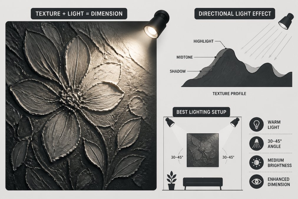
Best Lighting for Textured Art to Showcase Dimension
Lighting is the single biggest variable in how a textured palette knife painting reads. The same canvas can look flat under one fixture and sculptural under another. Four controllable factors decide it: direction, beam angle, color rendering, and brightness relative to the room.
Direction: why side light beats front light. A light aimed straight at the canvas flattens peaks because every ridge is lit evenly and casts no shadow. Move the source 30-45 degrees off the wall plane and each peak throws a shadow onto the valley beside it, that shadow is what your eye reads as depth.
Beam angle: match the spread to the artwork. The wrong spread wastes light or creates hot spots:
- Narrow (10-20 degrees): best for small pieces or for isolating one painting on a large wall. Creates a dramatic pool of light.
- Medium (25-40 degrees): the workhorse for most residential walls. Covers a 24-36 inch painting from a normal ceiling height.
- Wide (50-60 degrees): for large canvases or for washing a whole gallery wall evenly.
A practical rule: the beam should cover the artwork plus 6-12 inches of wall on each side. A pool smaller than the frame looks cramped; a much larger one loses the contrast that reveals texture.
Color rendering: the spec most people ignore. Color temperature (2700K warm, 3000K neutral, 4000K cool) sets the mood, but color rendering index (CRI) determines whether colors look true. Look for CRI 90 or higher; below about CRI 80, reds and oranges go dull or shift, a real problem for warm-toned palette knife florals.
Brightness and contrast. Texture only reads when lit peaks are brighter than shadowed valleys. If the room is already bright and evenly lit, an accent light adds little. Dim the ambient light slightly, or use a tight beam, so the painting sits a stop or two brighter than its surroundings.
Natural light and UV. Window light is free and often beautiful, but direct sun fades acrylic pigments and causes repeated expansion and contraction of thick paint. Filtered or indirect daylight through sheer curtains gives soft directional illumination without the UV load. In a bright room, UV-filtering glazing (in a frame that doesn't touch the surface) adds protection.
How to Hang Canvas Paintings with Raised Texture
Wall preparation and hardware prevent damage to both wall and artwork. Measure twice before drilling.
Find wall studs when possible, especially for larger pieces. If you can't hit a stud, use toggle bolts or heavy-duty drywall anchors, which distribute weight across a wider area.
Clearance prevents accidental damage. Mount your painting at least 2 inches from the wall if texture extends beyond the frame edge; this keeps dust out of crevices and protects peaks from being bumped.
Position paintings at eye level, around 57-60 inches from floor to center of the artwork. In galleries or larger rooms, adjust slightly higher. The goal is comfortable viewing without neck strain.
Protecting Paintings from Dust and Environmental Damage
Dust settles in the crevices and peaks of textured paintings, so clean gently every few months with a soft-bristled brush or compressed air. Never use a damp cloth on acrylic, moisture damages the surface.
Acrylic is durable, but extreme conditions accelerate fading and cracking. Avoid hanging near heating vents, AC units, or windows with direct sun. UV-filtering glass or acrylic in your frame adds protection if the painting receives any direct light.
Safe Transport and Storage of Textured Artwork
Never wrap textured paintings tightly in plastic or paper. Use bubble wrap with the bubbles facing away from the surface, and build a protective frame from foam board or cardboard strips taped to the frame edges so the wrapping never presses against texture.
For extreme texture, build a wooden crate with foam padding that doesn't touch the surface, leaving at least 1 inch of air space on all sides. Label it "FRAGILE" and "THIS SIDE UP," and never leave paintings in hot cars or unheated storage.
Store paintings upright, never flat, flat storage builds pressure on the back surface and can damage peaks. Cover with a breathable cloth rather than plastic (which traps moisture and promotes mold), and check stored paintings every few months.
Choosing Display Locations by Room and Artwork Size
Most hanging guidance stops at 'eye level.' For textured work, placement matters more: the painting only reveals its dimension at a specific viewing distance and height. Get the geometry right and the texture does the work; get it wrong and even a dramatic piece reads as a flat rectangle.
Start with the two-thirds rule for scale. A painting looks intentional when its width is roughly two-thirds to three-quarters the width of the furniture or wall segment it anchors. Above a 72-inch sofa, a 48-inch canvas sits comfortably; a 24-inch canvas looks lost. On a bare wall, aim for 60-75 percent of the available width between corners or doorways. This matters more with textured pieces because shadow play makes the painting read slightly larger than its frame.
Viewing height: center at 57-60 inches, then adjust for the room. The 57-60 inch centerline (measured floor to the middle of the artwork) is the museum and gallery standard because it matches average standing eye level. Adjustments:
- Above furniture: keep the bottom edge 6-10 inches above the sofa back, tabletop, or mantel so the painting doesn't crowd the furniture.
- Hallways and entries: hang slightly higher (60-63 inches center) since people view these standing and often in motion.
- Over a bed or in a dining room: center the piece over the furniture, not the wall, so the composition feels anchored.
Viewing distance: the number that actually reveals texture. Peaks and ridges resolve into readable shadow only when the viewer is close enough for the light angle to matter. As a rule, ideal viewing distance is roughly 1.5 to 2 times the painting's diagonal, a 30x40 inch canvas (50-inch diagonal) wants a viewer at about 6-8 feet. Two implications:
- Small textured pieces belong in intimate spaces, a hallway, a reading nook, above a desk, where people naturally stand within a few feet.
- Large textured pieces belong where people can back up, a living room wall, a stairwell, a gallery wall, so the whole composition and its shadow structure read at once.
If a textured painting will only be seen from across a large room, the texture becomes a subtle surface quality rather than the main event, worth choosing the piece with that in mind.
Room-by-room placement notes:
- Living room: the strongest wall (often above the sofa or fireplace) for a large focal piece. Directional accent lighting is essential; ambient light alone won't reveal texture.
- Bedroom: softer, smaller pieces on a side wall or above a dresser. Avoid hanging directly opposite the bed at seated eye level, where a dimensional piece feels visually busy.
- Hallway or entry: medium pieces at slightly higher centerlines, viewed standing and close. Texture reads well because viewers pass within a few feet.
- Office or workspace: position so a desk lamp or window doesn't throw glare across the surface; angled side light keeps texture visible without washing out screens.
- Gallery wall or grouping: leave at least 2-3 inches between frames (4-6 inches if frames are deep or pieces heavily textured) so shadows don't fall across a neighbor.
A quick scale reference:
| Display Location | Ideal Painting Size | Lighting Needs | Best Texture Style |
|---|---|---|---|
| Living room focal point | 36x36" or larger | Directional accent lighting | Bold, dramatic texture |
| Bedroom accent wall | 20x16" to 30x24" | Soft, filtered natural light | Gentle, flowing texture |
| Gallery or studio | 40x40" or larger | Controlled, adjustable lighting | Any style |
| Hallway or entry | 16x12" to 24x20" | Ambient room lighting | Medium texture |
| Office or workspace | 20x16" to 30x30" | Bright, non-glare lighting | Detailed, intricate texture |
Frequently Asked Questions
Can a palette knife painting be displayed without glass or framing?
Yes. Most palette knife paintings on canvas are displayed unframed to preserve the dimensional texture and sculptural quality of the raised paint. Gallery-wrapped canvas (like the Lilly Field Abstract) is designed to hang directly on walls without glass. Glass can flatten the visual impact of textured brushwork and create unwanted reflections. If you want protection, use a shadow box or floating frame with adequate depth instead of traditional glass framing.
How do you protect a textured palette knife painting from dust?
Dust settles on raised peaks and ridges. Use a soft-bristled brush or microfiber cloth to gently dust the surface every few weeks, always brushing in one direction to avoid pushing particles into crevices. Keep the painting away from high-traffic areas, ceiling fans, and open windows. Avoid using water or commercial cleaners on acrylic paint. For long-term protection, avoid areas with cooking smoke or fireplace soot, which can accumulate on textured surfaces faster than smooth finishes.
What is the best lighting for displaying a textured palette knife painting?
Accent lighting at a 45-degree angle highlights the peaks and shadows created by palette knife strokes, revealing the full dimensional quality of the artwork. Position track lights or picture lights 2-3 feet away from the painting to avoid creating harsh shadows. Avoid direct sunlight, which can fade acrylic pigments over time and create glare on glossy paint surfaces. Warm LED lights (2700K-3000K) complement floral and abstract textured work better than cool white light, bringing out the vibrancy of colors while emphasizing texture depth.
How far should a textured palette knife painting hang from the wall?
If you're using a shadow box or floating frame, ensure at least 1-2 inches of depth between the glass and the painting surface. This clearance allows viewers to appreciate the full sculptural quality of the raised paint texture from different angles.